TengTelc to-do’s

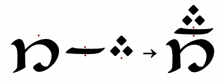
There are still a lot left to do design-wise when it comes to Tengwar Telcontar: for example, all the tengwar should ideally have a corresponding larger, ornated variant, but there are still some missing, notably rómen and silme. The s-hook, or sa-rince, should ideally be able to attach to any tengwa, but there are still some that lack this combining ability. Today, I drew a sa-rince for rómen, and if I may say it myself I’m pleased with the result:

Rómen with sa-rince

(That is supposed to be the Latin word ars (‘art’), by the way. Now that I write this I suppose that you could read it as if it were English, but that was not my intent.) Anyhow, correct me if I’m wrong, but I don’t think this particular combination is possible to write with any previous fonts, though it is in fact attested in Tolkien’s hand, in DTS 25. That specimen also exhibits an interesting lambe-lambe ligature. Hm…

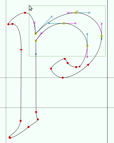
However, the next thing I’m going to work on, probably, is a rather major change, but which takes place behind the scene: when finished, the resulting font will barely be noticably different from the current version. The change concerns the method to position the tehtar. Today, tehta positioning is achieved by means of anchor points: each glyph has a number of anchor points defined, and then the glyphs are attached to each other in such a way that the anchor points overlap:

Diagram showing how a tengwa and tehtar combine.

While this is a fairly elegant and powerful technique, it also has its drawbacks once we need more precision in the positioning. It is difficult to place the anchor points in such a way that all the tehtar combine nicely with all the tengwar. In the example below, the tehtar and the tengwa óre all have their anchor points in the logical places, visually centered horizontally.

Tehtar attached to óre, compared with silme.

Now, where should the anchor point be placed on silme? We can align the i-tehta in a visually pleasing way, and then it will define silme’s anchor point. But, what happens if we then try to use that point to also attach the a-tehta? It won’t work very well: wider tehtar should ideally be adjusted to not collide with tengwar with ascenders. To deal with issues such as this, one could use more anchor points, introduce kerning after the positioning, use alternative glyphs, etc. Needless to say, things easily get very complicated.

That is one reason, but the main reason why I’m moving away from anchor points is that they are difficult to implement with AAT, Apple’s smart font technology, and I would very much want to have Tengwar Telcontar work on the Mac. So, instead of anchor points, I will rely solely on contextual glyph substitution: exactly as how tehtar are positioned in Dan Smith’s fonts, there will be a number of glyphs for each tehta, each with varying displacement, but unlike Dan Smith’s fonts, the correct glyph will be chosen automatically, and, for me as a designer, there is no specific restriction on how many different glyphs I may use — I foresee that I may use as many as ten or more for each tehta, to get exactly the positioning I want on each tengwa.

In short, I will have to rewrite a large part of the code, but the end user will probably not notice the difference. Unless they use a Mac, that is.

Comments (9)

Metafonts

(If you have never heard about Metafont before, you might be interested in reading the Wikipedia article before continuing with this post.) Metafont is very different from usual font editors, such as Fontlab or FontForge; in fact it is not an editor at all, but rather a compiler that takes program code as the input and outputs a font. To design with Metafont is much more similar to writing a computer program, than to draw a picture.

Read the rest of this entry »

Leave a Comment

Skeletons

I have decided to write a series of posts explaining how Tengwar Annatar and Tengwar Telcontar were made, since I have received some questions about it over the years. To begin with, the most common method used when digitizing a typeface is to draw the outlines of the glyphs using Bézier curves:

Contour of tinco made up of Bézier curves

These Bézier curves are convenient to work with, and you can easily form virtually any shape with them. In fact, I found out when I started working on my first font that they were too versatile for my needs. So far, my fonts have been essentially calligraphic; that is to say, the glyphs are designed to look as if written with a pen. And when I attempted to achieve this by drawing the contours, I found that far too much time went into such things as ensuring consistent weight, forming nicely rounded line endings, etc. But if I were to write the letters using the method I wanted to imitate, i.e. with a pen on paper, I would not have to worry about things like that. All those features would come automatically, since they are defined primarily by the pen itself, independently from how I move it. (Obviously I’m talking about an “ideal” pen here.) What I wanted to spend my time on was to define the motion of the pen.

Read the rest of this entry »

Leave a Comment

Annatar sketches

I found some old pencil sketches from when I started working on Tengwar Annatar Italic (about 2003):

Read the rest of this entry »

Leave a Comment

The history of Tengwar-Gandalf

The classic font Tengwar-Gandalf by Michael S. Elliott has no official web site – being originally released through BBS! It is however available all over the web, on various Tolkien fan sites (here, here, and here, to name just a few), as well as on most generic font sites. At all of these places, the font has been repacked: sometimes the archive contains only the TrueType font file, sometimes the original plain text documentation is included but not the illustrated one, and sometimes other files are added as well: for example, this archive contains converted font files in Type1 format. Thankfully, the original TTF file seems to be byte for byte identical in all distributions.

Example of Tengwar-Gandalf v. 1In my quest for a more original release, the closest I have come is this SIT-archive, which in addition to the same old TrueType font file also contains the illustrated documentation file and a Type1 version of the font, containing an extra glyph (the s-hook) – in other words, it is not a mere conversion of the TrueType file. The files in this archive are dated May 1993. Now, because SIT-archives are cumbersome to open, and because old Mac fonts need to be extracted to be usable on other operating systems, I have prepared an updated package of the font:

This version of the font is well known for its reversed lambe. The simple explanation for this somewhat curious shape is that it is a copy of the “T” in the public domain font Black Chancery. (In the same way, the rómen is a slightly modified “y”.) What is less known is that Mr. Elliott shortly after the original publication released an updated second version which features many improvements, such as refined u and o-curls, an extended character set including all the tengwar in the Appendix table, and a corrected lambe. This updated version can still be found to this date on various obscure sites and archives, but unfortunately it seems like it has never managed to reach a larger audience. (I for one had never heard about it.) Read the rest of this entry »

Comments (8)

Annatar rants

In general, people seem to like my Tengwar Annatar font, because I see it used fairly often — mostly, of course, in the cursive variant mimicing the ring inscription, since there’s really no better alternative to it, but also in the upright version. In a way, this is naturally flattering, but it also irks me somewhat because of what I now see as shortcomings in its design. Except for the bad decisions on my side, these are due primarily to two things: limitations in Dan Smith’s encoding model, and the outcome of automatic transcribers. An example:Shortcomings in Tengwar Annatar So, what is wrong with this picture? Read the rest of this entry »

Comments (2)

Tengwar Telcontar 0.08

After more than two years, an updated version of Tengwar Telcontar is finally available. For more information, head over to the Free Tengwar Font Project, or see the announcement on the Elfscript2 mailing list.

Leave a Comment

Free Tengwar Font Project

We live in exciting times! The well known Tengwar enthusiast J. “Mach” Wust recently started the Free Tengwar Font Project, aiming at collecting free (as in freedom) Unicode Tengwar fonts and associated tools in one place. This I think is a great initiative, and I hope to make Tengwar Telcontar a part of this project.

Mach has also created a monospace font, FreeMonoTengwar, which, in the same spirit as Tengwar Telcontar, is intended to be a fully usable unicode font for Tengwar. Mach has quite ingeniously tried to solve the problem of tehta-alignment by means of ligatures, which have the not insignificant advantage of being supported by many more systems and programs than Graphite fonts.

Leave a Comment

Graphite and OpenOffice

Just a short note to inform that it is now official that the next major update of OpenOffice.org will include native support for Graphite fonts – such as Tengwar Telcontar. However, I’m dismayed to see that this only applies to the Windows and Linux version, which means that, as far as I know, MacOS still lacks a viable way to use Graphite fonts.

Update: Except for XeTeX that is.

Comments (2)

Number of Tengwar fonts

During the discussions that took place during Omentielva Nelya regarding the encoding of Tolkien’s scripts, we touched on the subjects of which script is most popular. Of course, Tengwar is more popular than Cirth; if nothing else, the number of fonts is an indicator of this. There might be a bit over five Cirth fonts (I have not investigated this carefully), but what about the Tengwar?

Just for the fun of it, I have attempted to count the number of Tengwar fonts in existence. I have listed vector fonts of any format and encoding model. (I regard TeX-fonts as vector fonts; however, low resolution bitmap fonts have been ignored.) Since I am here mostly interested in the number of unique designs, I have chosen to include also fonts that are not publicly available. The list is roughly cronological (at least in the beginning).

  1. teng10 by Julian Bradfield
  2. tengwar by Michael Urban
  3. Moroma by Lawrence M. Schoen
  4. Tengwar Gandalf by Michael S. Elliott. (Updated/plagiarized as Tengwar Sindarinwa.)
  5. Gondolin by Michael Everson. (Used in the Unicode proposal, but not publicly available.)
  6. Tengwar Quenya by Dan Smith
  7. Tengwar 04 (03, 05) by Paulo Alberto Otto. (Also known as Tengwar Hereno.)
  8. Tengwar Sindarin by Dan Smith
  9. Tengwar Noldor by Dan Smith
  10. Tengwar Naive by Johan Winge (me)
  11. Tengwar Parmaite by Måns Björkman
  12. Tengwanda Namarie by Deniart Systems
  13. Tengwanda Gothic by Deniart Systems
  14. Tengwar Cursive by Harri Perälä
  15. Computer Modern Tengwar by Ivan A. Derzhanski
  16. Computer Roman Tengwar by Ivan A. Derzhanski
  17. Code2000 (2001, 2002) by James Kass
  18. Tengwar Typewriter by Jeff Anderson
  19. Elfetica by Ronald Kyrmse
  20. Tengwar Elfica by Enrique Mombello
  21. Tengwar Teleri by Josh Griffing
  22. Tengwar Annatar Italic by me
  23. Tengwar Annatar Upright by me
  24. Tengwar Formal by Michal Nowakowski
  25. Tengwar Mornedhel (Galvorn) by Josh Griffing
  26. Tengwar Gothika by Enrique Mombello
  27. Tengwar Eldamar by Måns Björkman
  28. Tengwar Telcontar by me
  29. Tengwar Beleriand by Enrique Mombello
  30. Constructium by Kreative Software
  31. The publications by Thorsten Renk use a unique font (partly based on Bradfield’s teng10).
  32. FreeMonoTengwar by J. “Mach” Wust
  33. Tengwar New (Light and Bold) by Marcin Przybys. (Not available for download.)
  34. Elfic Caslon by Peter Wiegel
  35. Greifswalder Tengwar by Peter Wiegel
  36. Tengwar Optime by Peter Wiegel
  37. Tengwar Tellepsalinnacontar by “Tencedil”

All in all, a pretty impressive number, I would say.

(This post was last edited on Aug 30, 2010.)

Peter Wiegel

Comments (39)

Older Posts »